Dirty Bird to-go
Joined Dirty Bird to-go at its initial conception to help with its initial launch. It’s a fast slow food restaurant featuring healthy local chicken and sides.
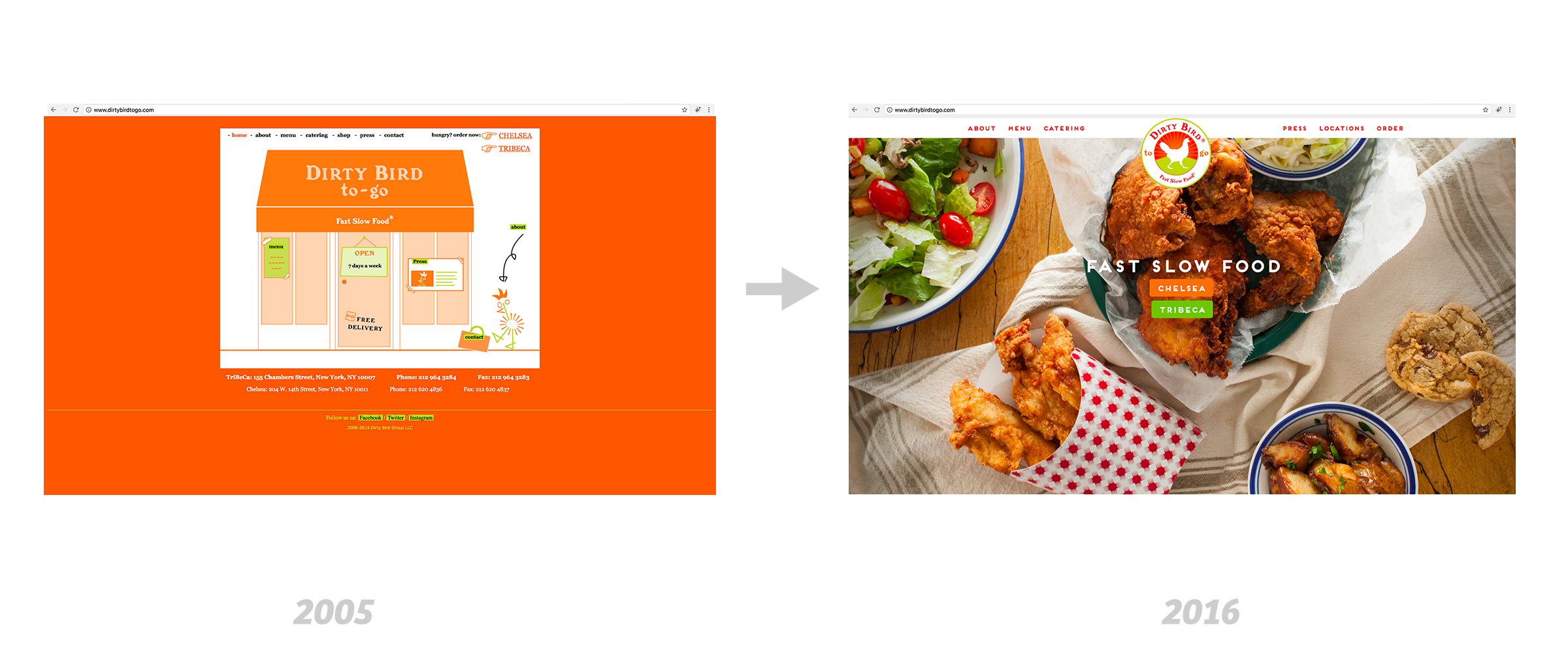
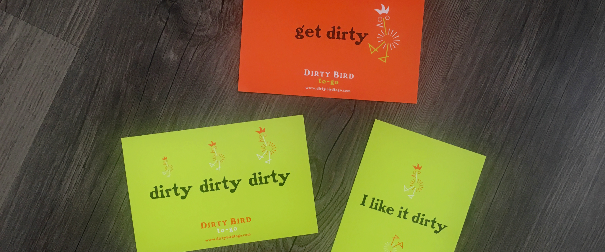
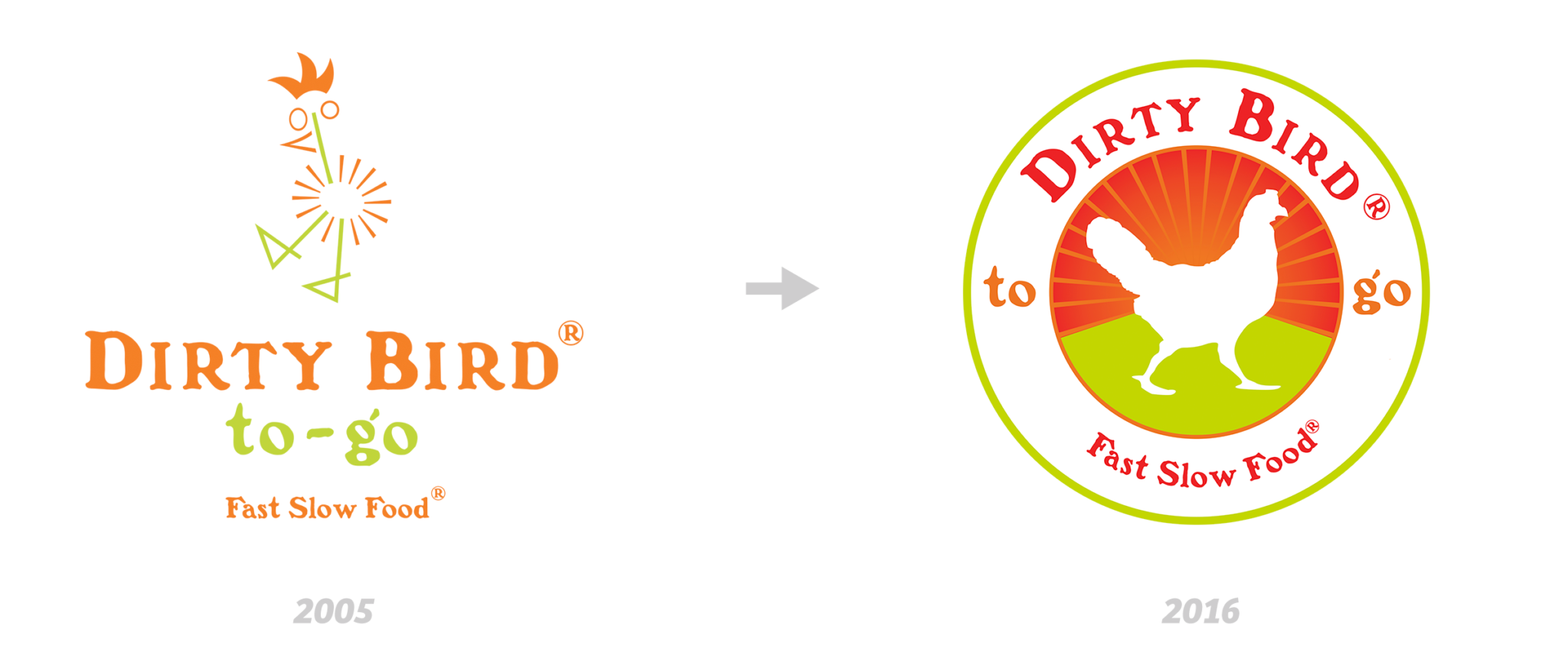
New Brand (2005)
The owners wanted to disrupt the takeout delivery restaurant landscape by providing quality food that’s meant to be savored and not rushed. Interviews were conducted to understand the stakeholders’ expectations, and market analysis were completed in order to understand the current landscape and its potential competitors. The solution is to create a playful and quirky brand with a mascot to draw attention and ignite curiosity of the target audience. The strategy worked as the restaurant received the much needed attention and started to get recognized within the industry while developing a positive reputation among patrons.
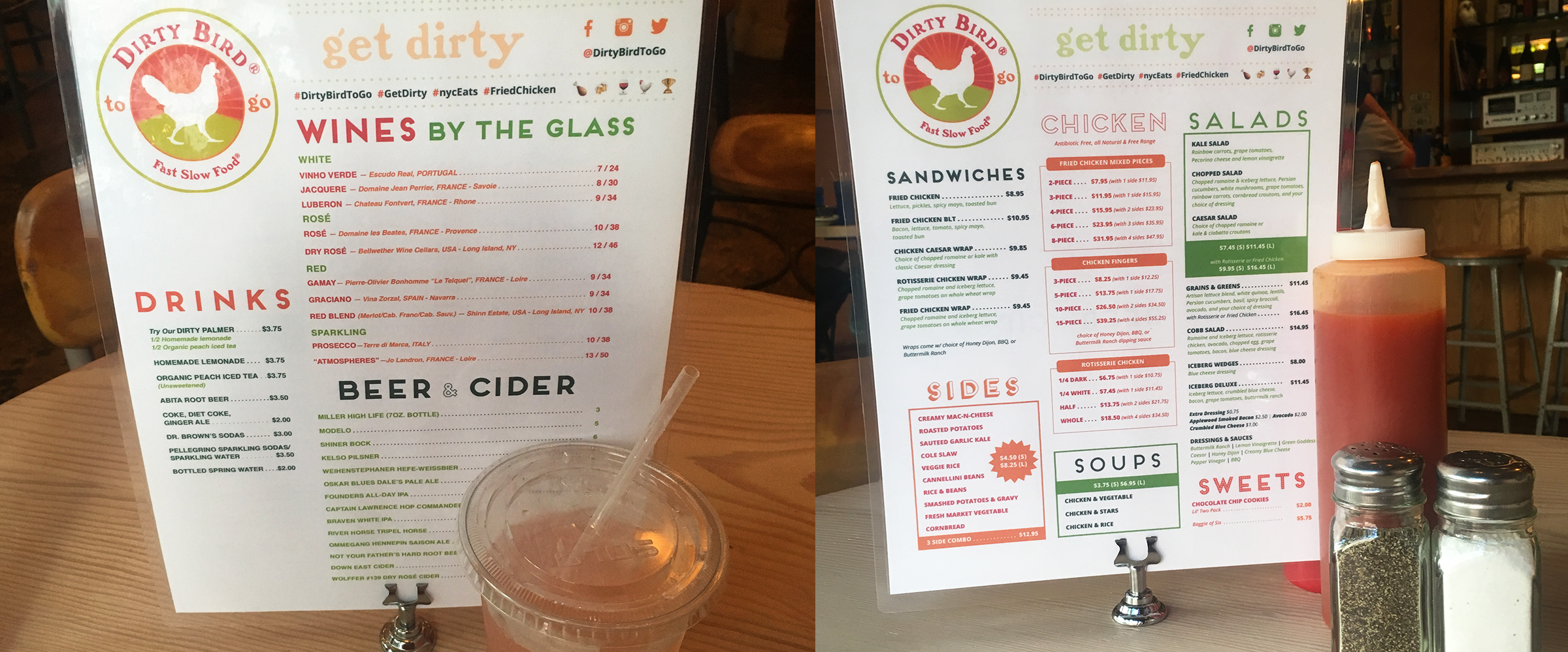
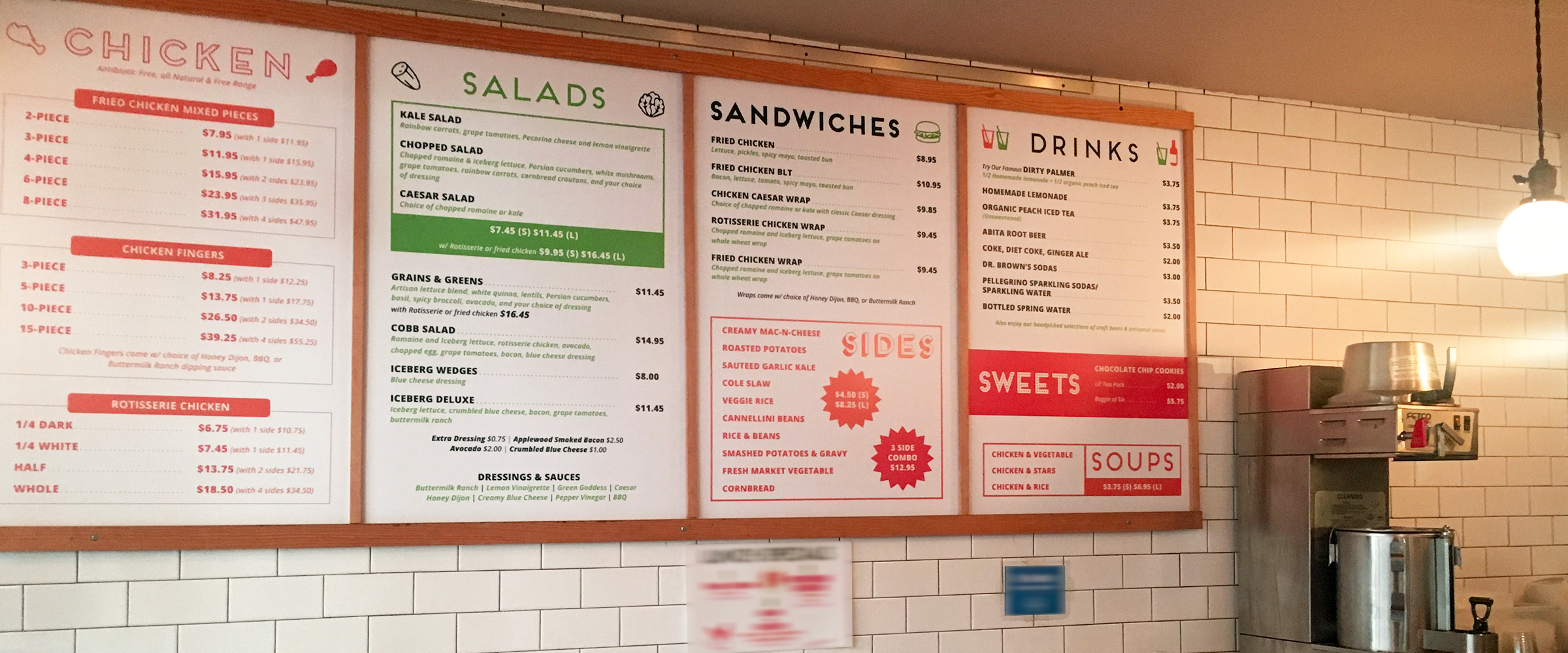
Brand Refresh (2016)
Dirty Bird to-go is an established name within the industry and has a stable and growing customer base, a brand refresh is needed to reflect its current standing. After stakeholders interviews and a detailed market analysis, the solution is to create an emblem-like logo with a more subdue mascot and color palette. The goal is to express a sense of trust as a well established restaurant group. We shifted from the primary use of illustration to bold typography and food photography, and created a set of subtle illustrated icons for secondary use; the brand is still playful but is more serious and matured.
