Access A+E
Started as a POC to provide an employee benefit, a video viewing platform where all A+E video contents (TV shows, movies, and documentaries alike) are available. As the POC evolved and grew, stakeholders took interest in adding a search functionality to the app’s videos catalogue, and turning it into a robust work tool for multiple user groups who needs to conduct content based research on a daily basis. As we work to develop this, the stakeholders further requested we add functionality of another tool that is about to be sunsetted, which is the photo library search tool. Thus combining search functionality across video contents, photography library, brand assets, and marketing collaterals. All in all, Access A+E is becoming “the” search tool of the company’s internal users.
Challenges
Since pivoted scope of work, the app needed to be redesigned in all aspects, from the name to look & feel to interface to workflow. We had to conduct new surveys to gather new user insights and analyze them to create the suitable visual solutions for this new product.
Solution
First we need a name that encompasses the app’s capabilities, second, we need an interface that speaks to multiple sets of users with various goals, and last but not least, the work flow should easily guide the user through the complex catalogue of content.
Branding
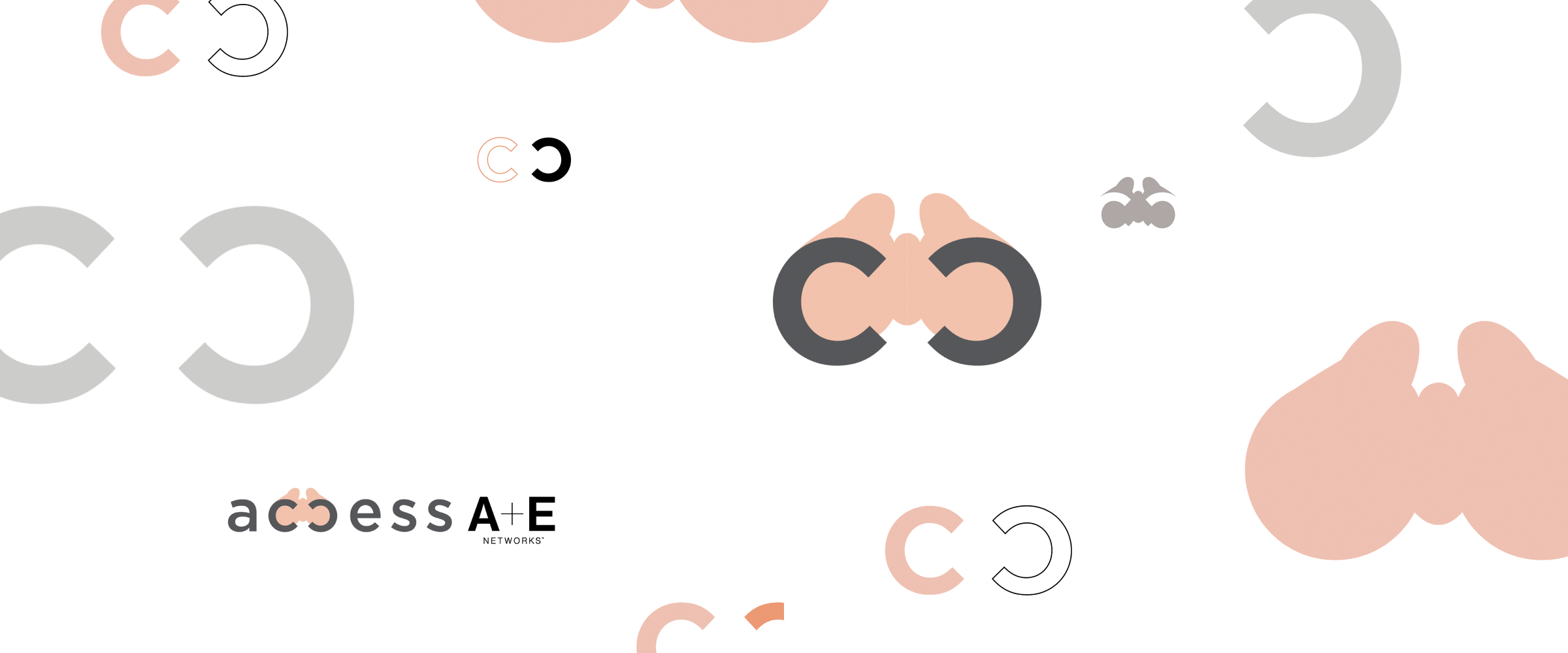
Access became the obvious choice after a few rounds of name-storming sessions. Our team felt that since there are so much content to search from, the word access is just right to leverage this quantitive character. When designing the logo, I flipped the second “c” in access to help form a visual binocular to further play with the visual association of searching within vast amount of information. In terms of colors, we are using the A+E corporate brand colors to ensure it has the visual connection with the main brand.
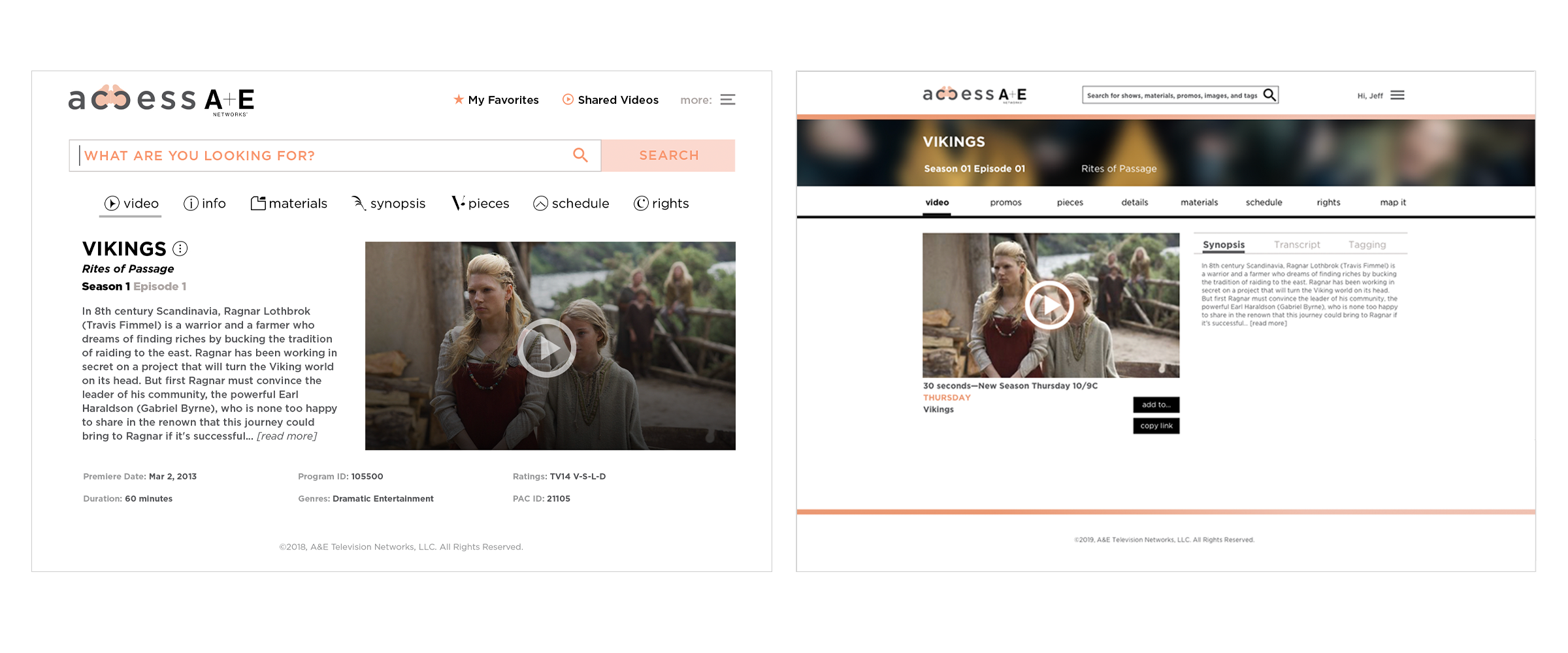
UI
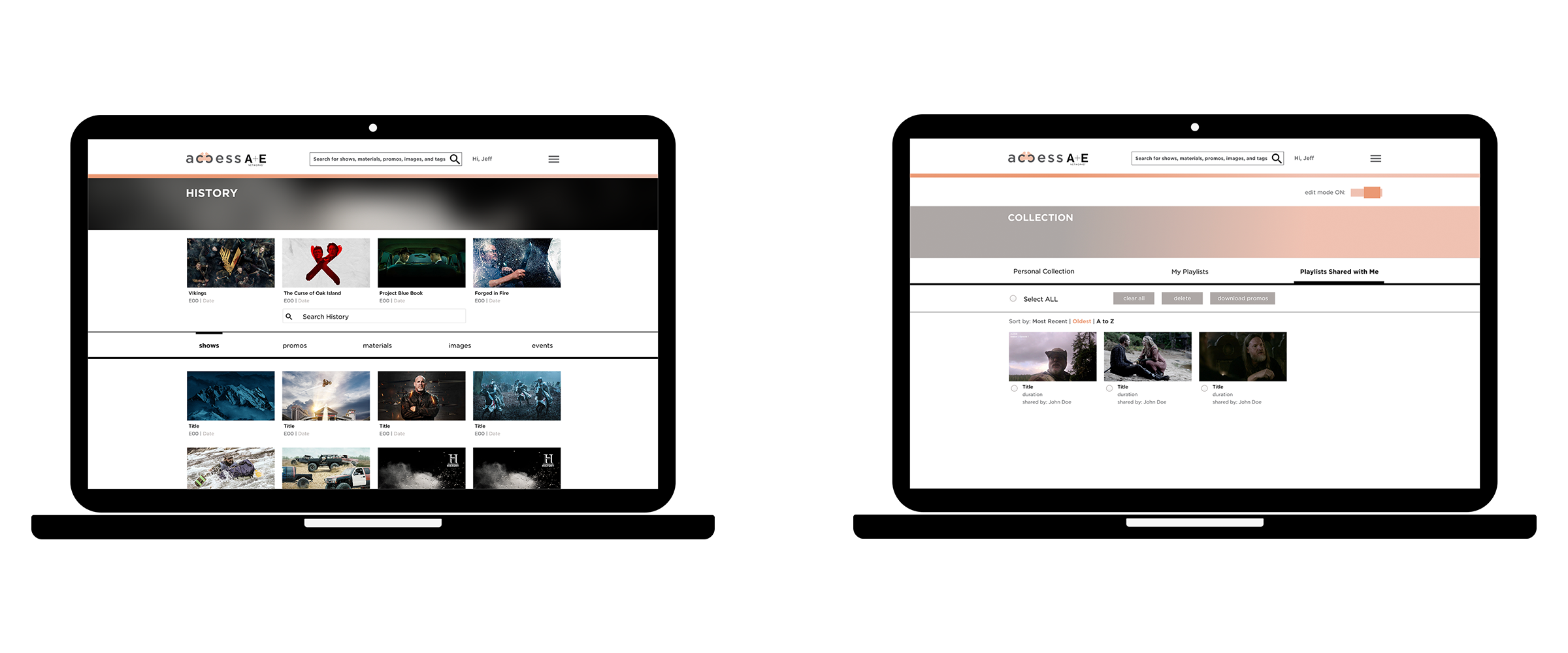
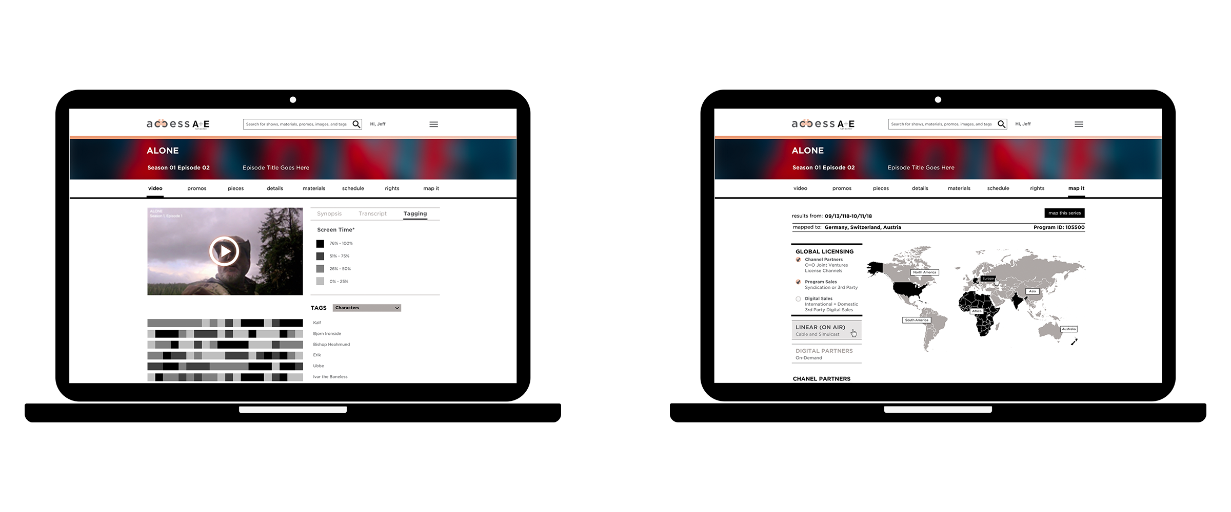
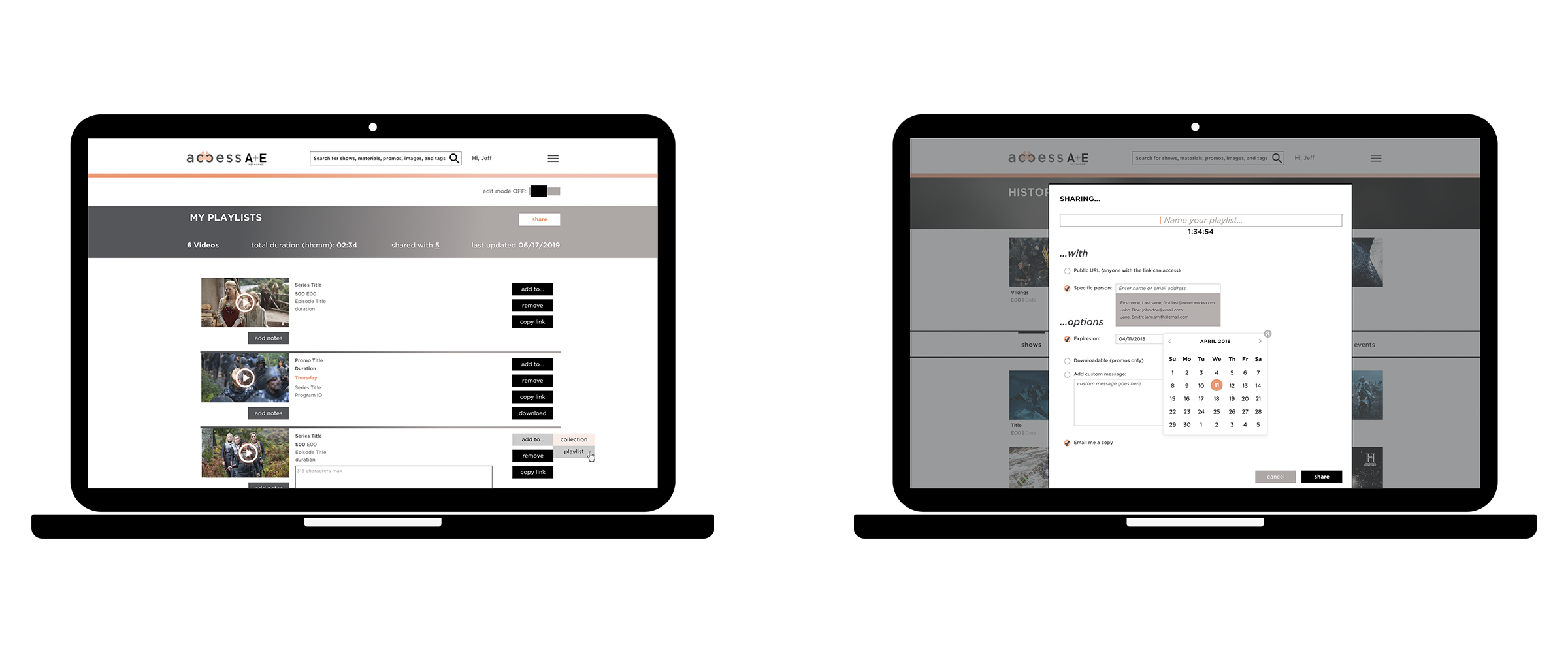
Initial approach includes heavy use of iconography, along with a dominant search bar to highlight the product’s robust search abilities. As the product evolves, it’s becoming more data-heavy, hence the final iteration employs streamlined look & feel, put less emphasis on the search bar, and eliminated the use of icons.
