A+E Technology Department rebrand
In order to stay consistent with the newly redesigned corporate brand, a rebrand was needed for the technology department. We leverage this opportunity to develop a scalable identity system to better represent the growing body of sub-brands and cultural initiatives within the department.

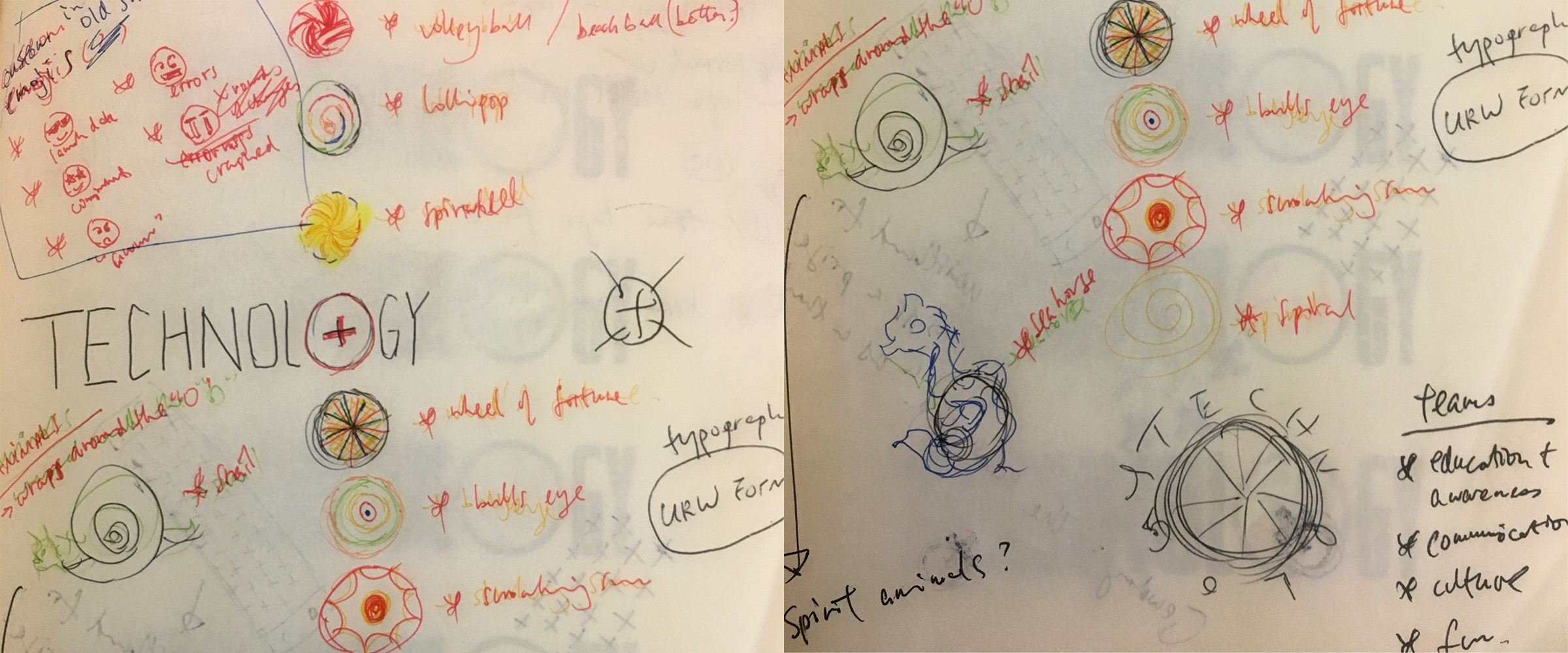
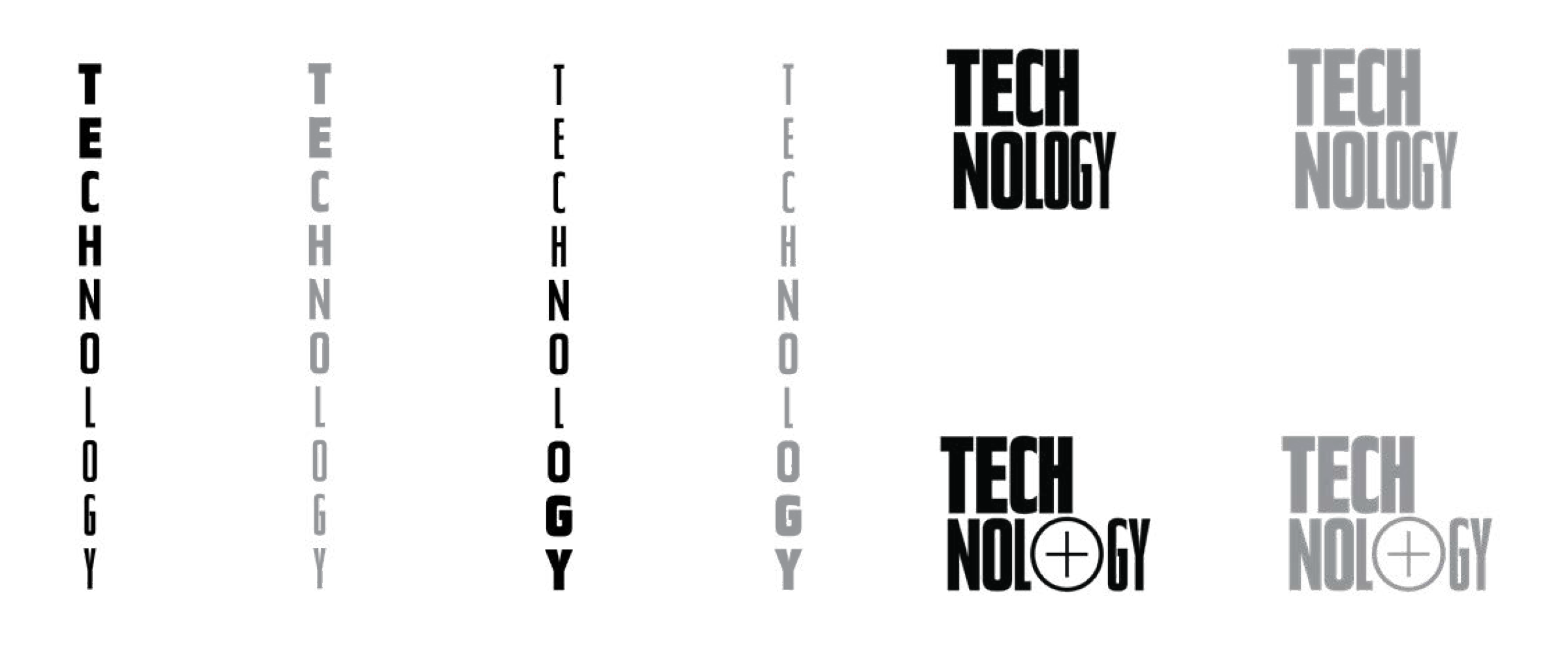
Two logomarks were developed: one to use when the A+E Networks logo is present, the other is for standalone use and has incorporated the “+” from the corporate logo.
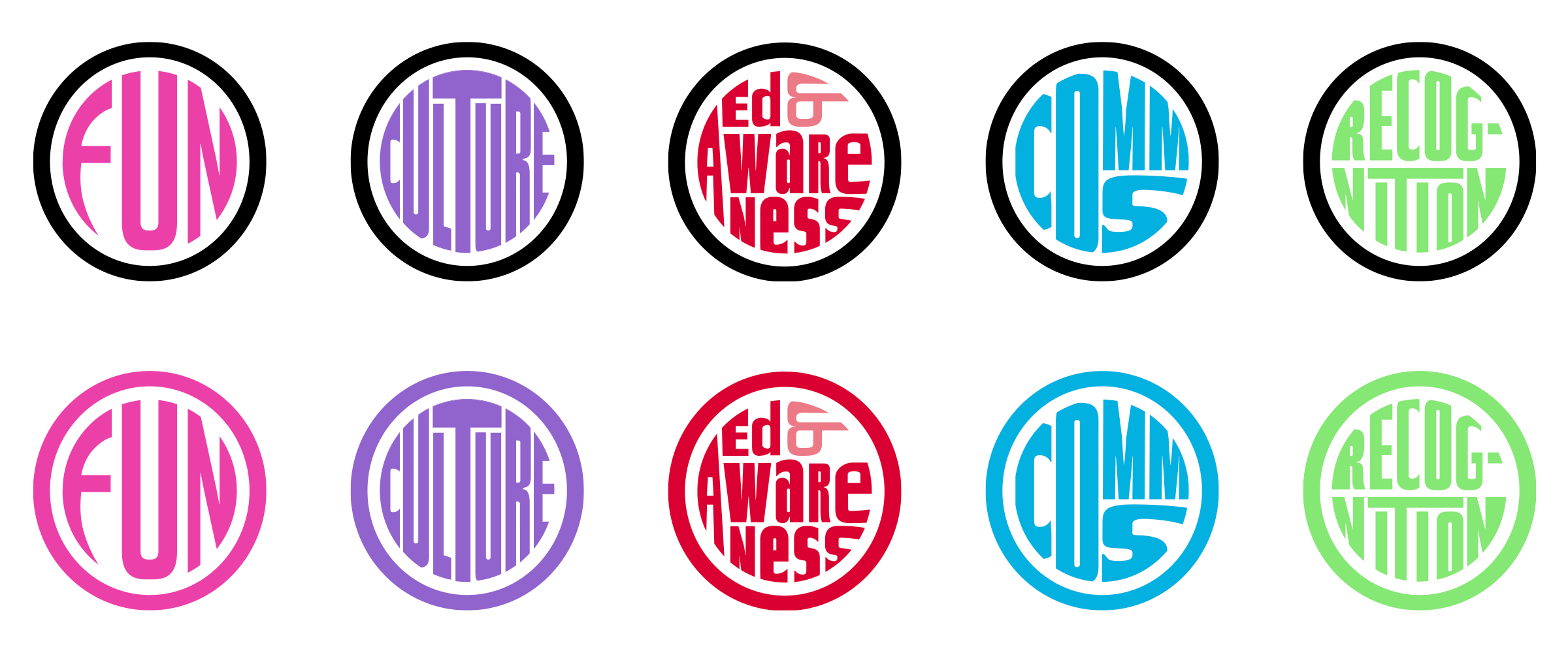
To reflect the diverse and inclusive nature of the department, we set the all logos in various fonts of a selected typeface. We applied the font variety with the typography treatment of the messaging of the departmental values to push the message further.

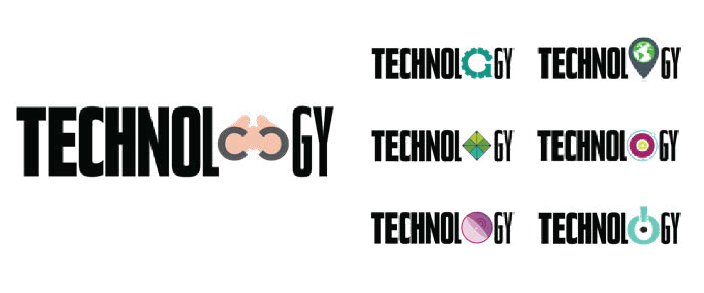
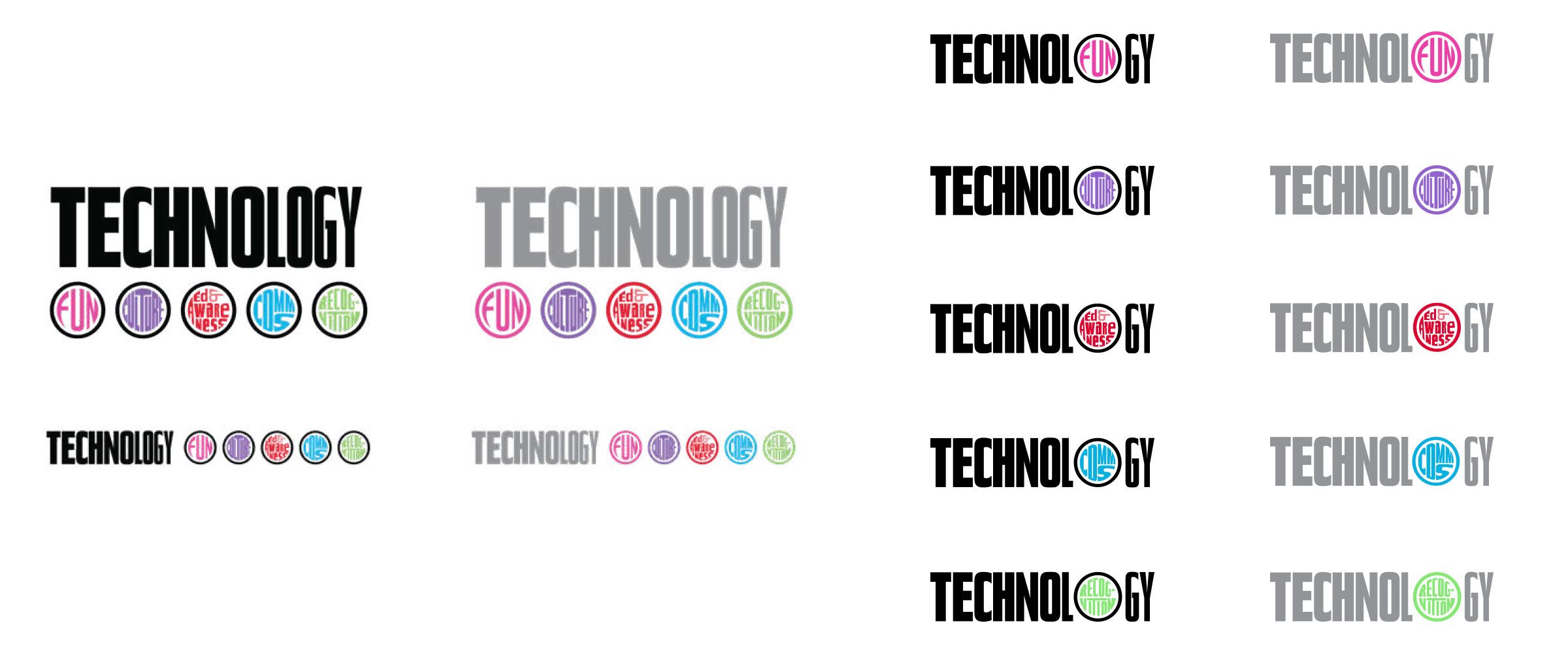
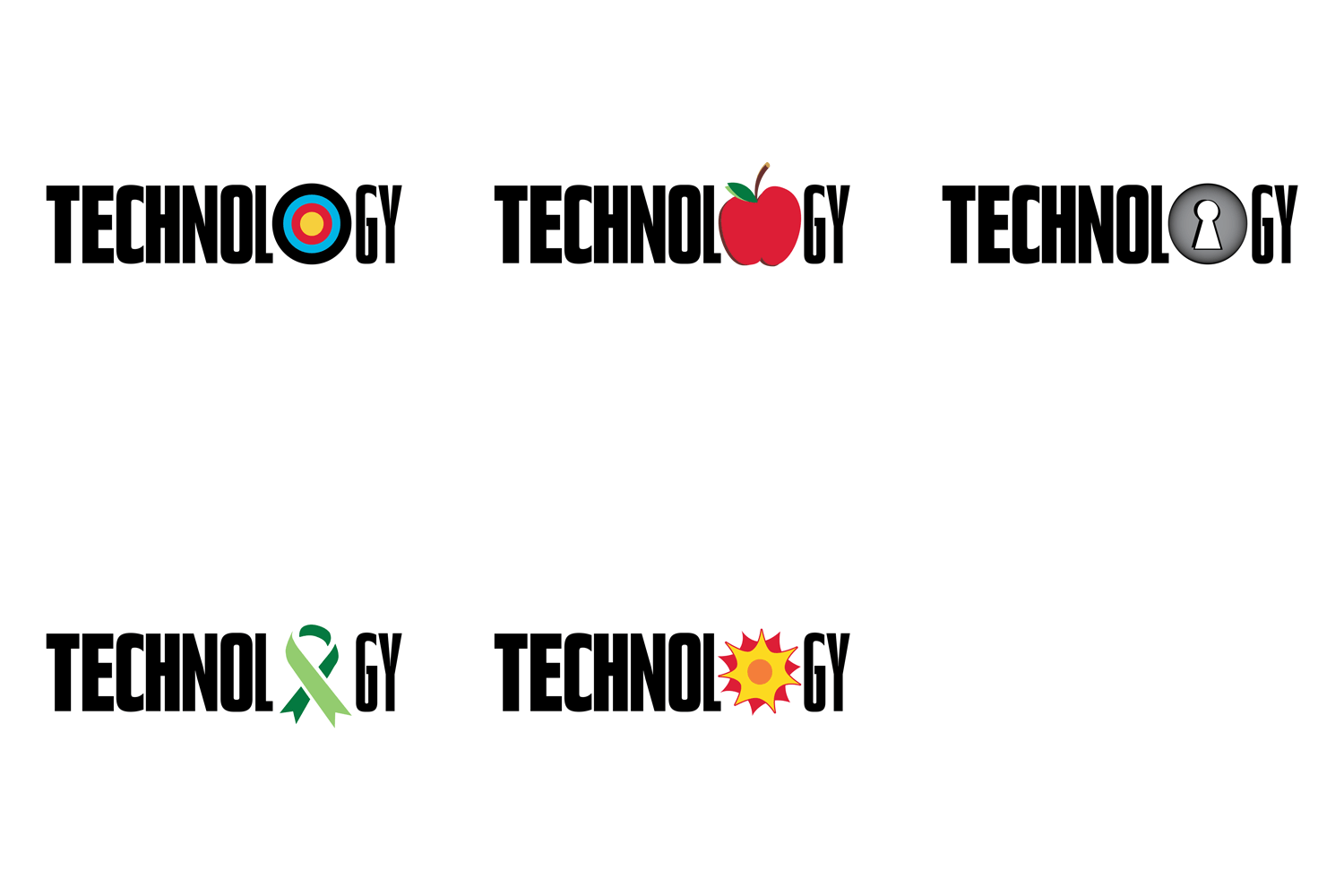
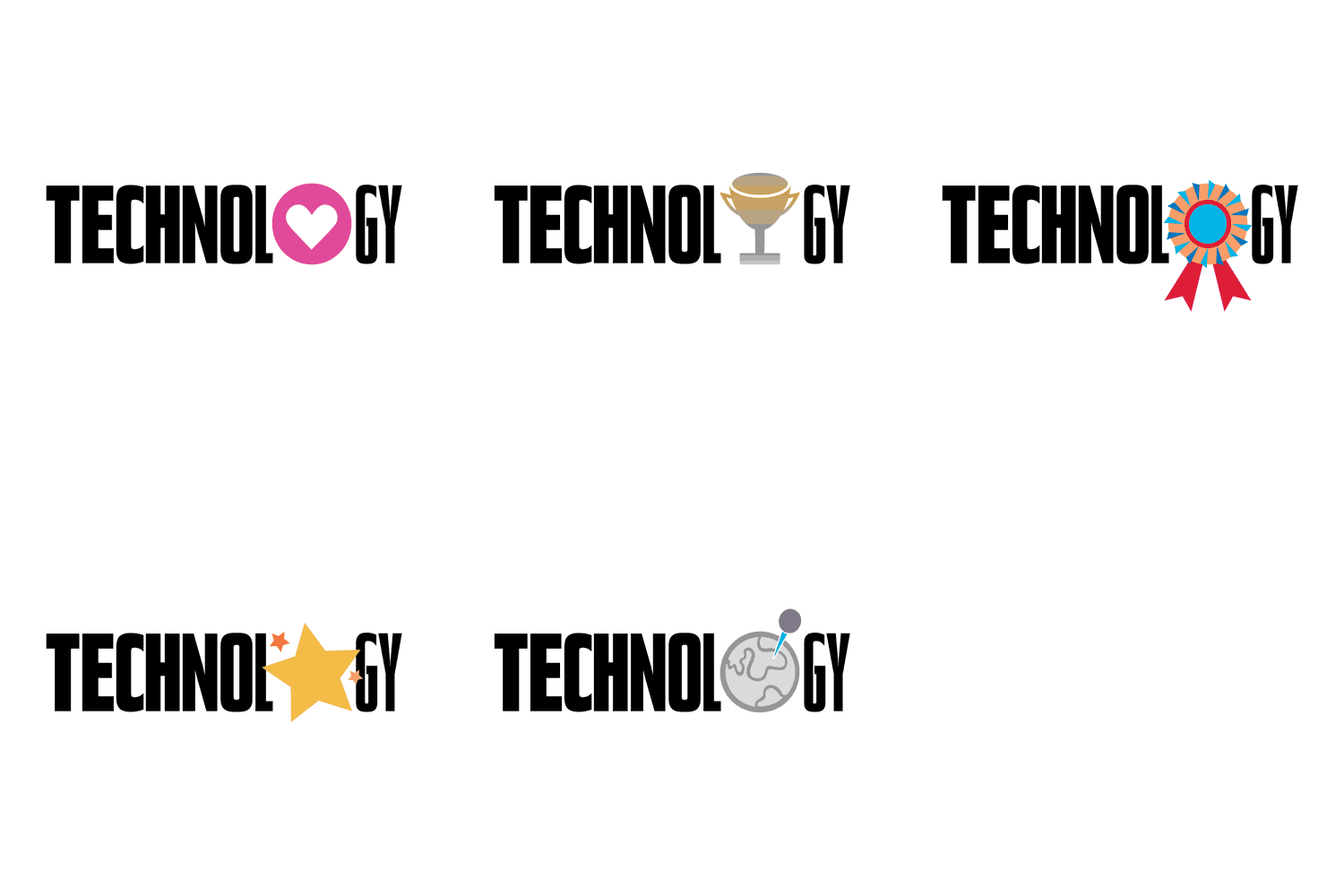
Expressing a sense of versatility and adaptability, the “O” in the word technology has become home to the sub-brand logos as well as the set of graphics created to represent the cultural values within the department.
The end result is a complete design system with a familiar visual reference to the main corporate brand while enabling a structure to accommodate the extensive values within the technology department.
