+Help
Stakeholders needed to direct as many employees to this self-help portal as possible in order to alleviate the workload of the understaffed call center, and to ensure the global employees can get help 24/7, as the call center is located in LA and can only provide service during west coast business hours.
Role
- Visual Design Lead
Challenge
How to attract more employees to use this portal instead of calling tech support for every issue?

Solutions
Increased Visibility
Several offices have a physical TechCafe employees can visit for in-person troubleshooting, but not a lot of employees know about them. New signages were created to make TechCafes easily located, self check-in kiosks are available for employee walk-ins, while desk drops and email communications were sent to raise awareness.


24/7 Digital Access & Ease of Use
A self-help portal and knowledge base for the A+E employees, where all information are easily accessible whenever wherever. +Help is a robust digital experience that employs a simple to use 3-click ticketing system, an at-a-glance top bar with all the active tickets and orders, as well as a dynamic search bar in the knowledge base to make information easy to find.
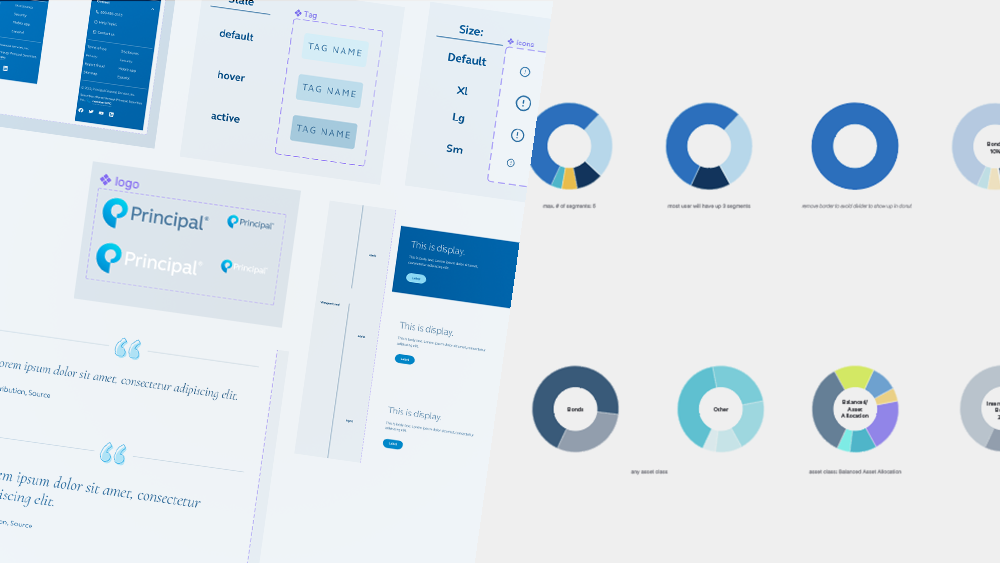
Updated Branding & UI
The product’s logomark incorporates the “+” from the corporate logo, introducing the corporate value of connectedness to the product while making a visual reference to the corporate brand. Extracting selected elements and accents from the corporate style guide, the intention is to create a minimal, stylish, and friendly experience that draws visual reference to the corporate identity to create a sense of familiarity. The use of icons are limited to essential elements only to reflect their importance by establishing a resolute hierarchy.